
Goal Alignment
The main goal with these recent updates was to make the site easier to use - both in how it looks (UI) and how it feels to navigate (UX). The core idea of my site hasn't changed: it's still a vaporwave-inspired portfolio that brings together all my creative and technical work - especially game design, fight stick art, and interactive media. But now, the improvements help users move through the site more smoothly, and everything just feels more consistent. Since my main audience is potential employers, I want the experience to be clean, simple to understand, and easy to get around. These updates don't just improve how the site functions; they also give me a chance to show off my front-end skills using HTML, CSS, and JavaScript. On top of that, I also started thinking more about accessibility. I wanted to make sure that users with different needs - whether they're using a keyboard, screen reader, or just don't want to scroll endlessly - can comfortably explore everything I've made.
Information Structure - Content Mapping
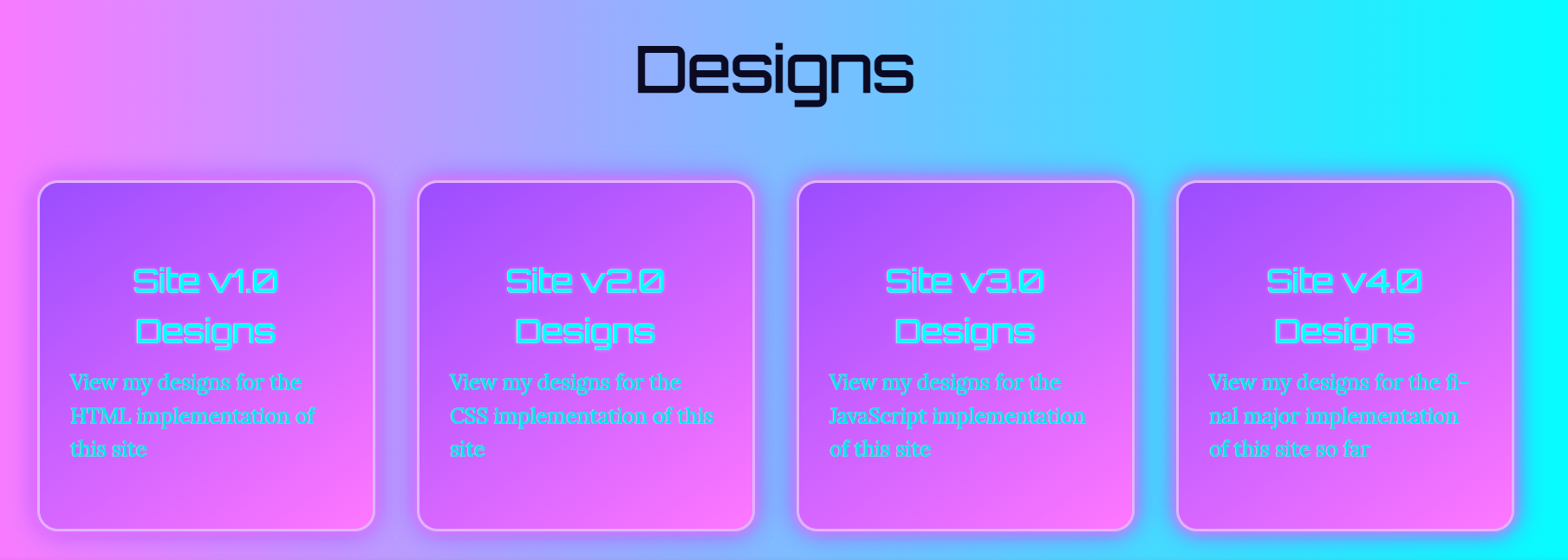
The Contact page stayed mostly the same because their content is pretty straightforward - there isn't a need to break things up. It is already quite linear, and that works in its favour. But for Portfolio, Blogs, Essays, and Designs I moved to a modular card-based layout. This change makes a big difference. Each entry (like a blog post, essay, or design version) now has its own “card,” which makes the layout cleaner and lets users browse without getting overwhelmed by one massive wall of text.
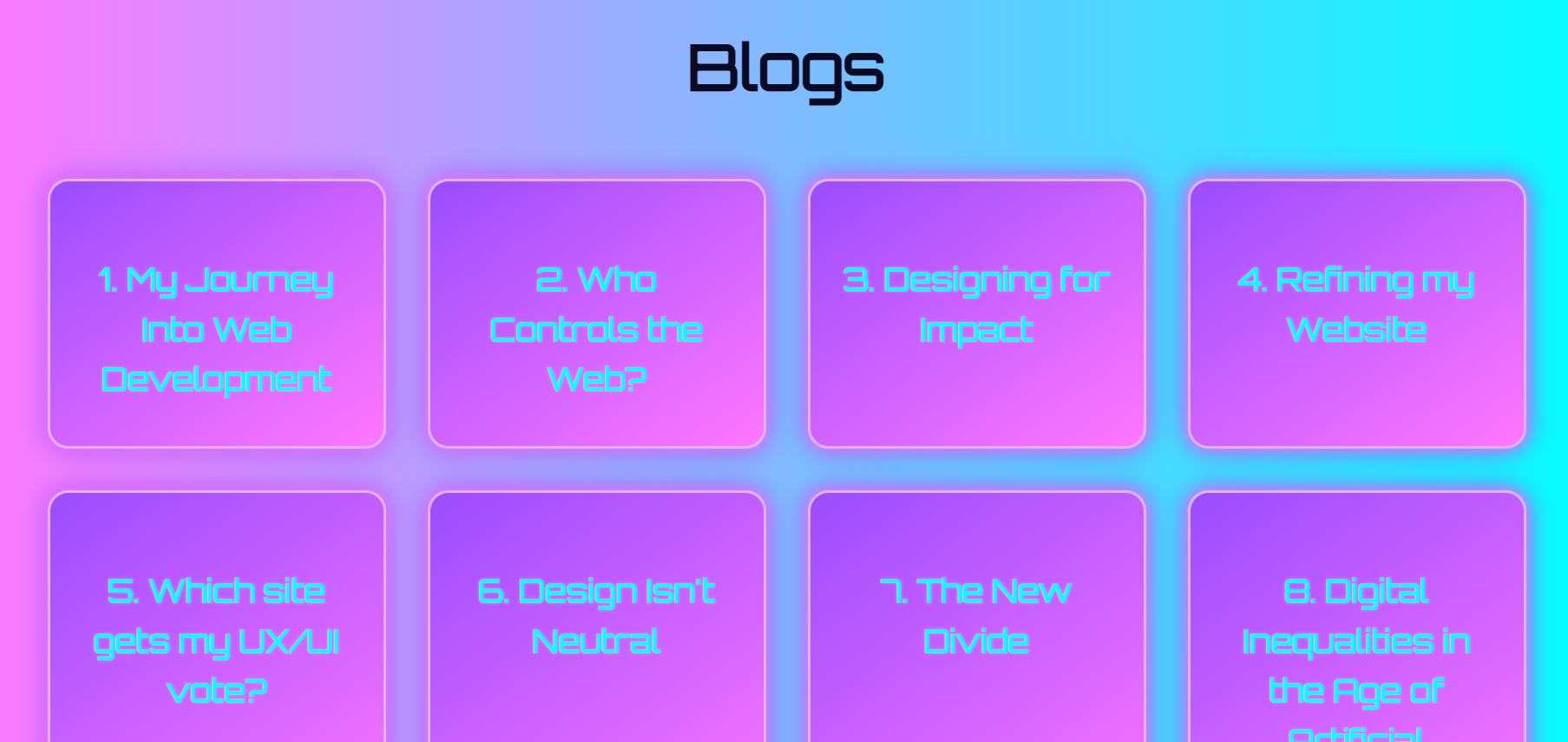
This also makes the site way more scalable. If I write a new blog or essay or upload a new project or design implementation, I can just drop in another card - no need to rearrange the whole page. From an accessibility perspective, this change also makes it easier for screen readers to parse each item individually, rather than having to sift through long, unbroken content. Previously, Blogs, Essays and Designs were just single scrolling pages, but I realised that wouldn't work long-term. It would eventually make things messy for everyone - especially people who rely on assistive tech or just want to get to the point faster. The navbar order stayed the same: Portfolio → Designs → Blogs → Essays → Contact. I put Portfolio first on purpose - it's the section I want employers to check out first since it's the most directly relevant to the kind of work I do.
User Flow - Screens, Behaviour, and Decisions
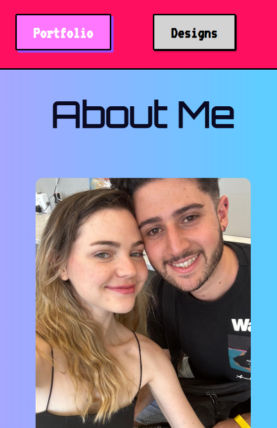
The homepage is the first thing people see, but it's minimal on purpose. There's just enough there to catch someone's interest and guide them to the main content using the navbar. The first major section is Portfolio, which links to:
- About Me (background + experiences)
- Credentials (my downloadable CV)
- Fight Stick Designs
- Games
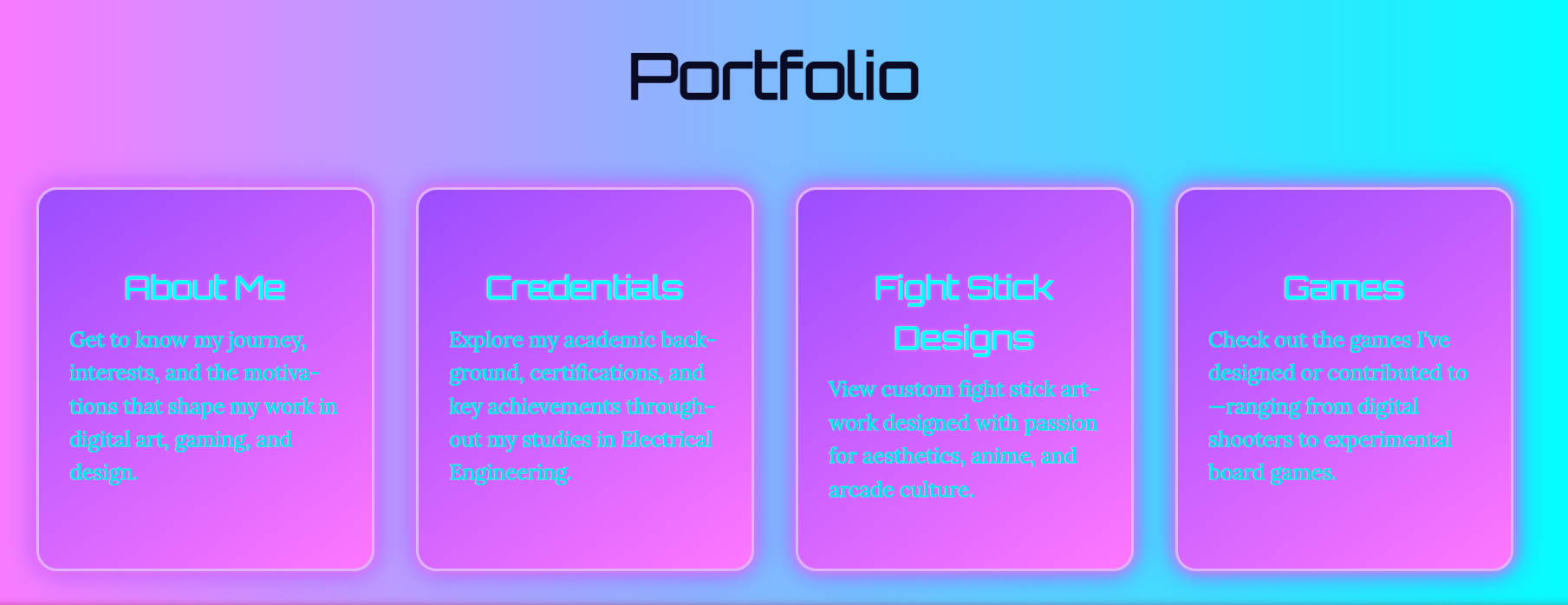
These pages give a good mix of my personality, technical skill, and creativity. Employers can quickly get a sense of who I am and what I'm capable of. Next up are the Designs pages. It's where I explain my design choices and inspirations. Since there's a lot going on in each of the design version sections, I added a hamburger menu to help people jump to specific parts of the page. This is especially useful for anyone who may have difficulty with scrolling or is using a keyboard or touch navigation - they can just go straight to what they want without digging through the whole thing. Then there are the Blogs and Essays sections, which now have card selector landing pages (along with the Designs page). Each card includes a title and/or short description, so people can preview what they're clicking into. Once someone chooses a post, they can navigate using the “Next” and “Previous” buttons at the bottom of each page. That means you can either browse freely or read everything in order - both options are available. This approach also reduces information overload and helps users who prefer smaller, focused chunks of text. Finally, the Contact page is simple and to the point - just the info someone would need to reach me if they're interested in my work. JavaScript Navigation Features Here are a few quality-of-life navigation features I added using JavaScript - all of which help the user feel more in control:
- Navbar highlighting: When you're in a subpage (like the Games section), the parent category (Portfolio) stays highlighted. This helps users, especially those who might lose track of where they are, keep their bearings.
- Back-to-top button: Shows up after scrolling 200px. It's useful for keyboard or mobile users and helps anyone who has trouble with long scrolling quickly return to the top.
- Hamburger menus: Used on dense pages (like Designs) to allow precise section jumps. This helps users navigate efficiently - especially those with accessibility tools like screen readers or custom input devices.
- Card-based layout (Blogs, Essays, Portfolio, Designs): Helps break up long text and gives users clear visual cues for what each post is about. It's also easier to tab through with a keyboard or navigate with assistive tools.
Together, these features make the site easier to use for everyone - regardless of how they interact with it - and also showcase some of my strongest skills in modular design, DOM scripting, and accessibility-aware UI building.
List and Explanation of Selected Interface Elements
Hamburger Menu
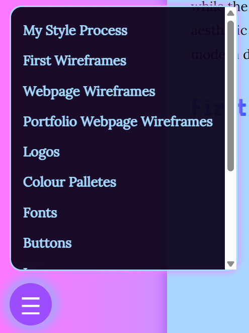
Some pages, like the Designs page, can get a little content-heavy. To prevent users from endlessly scrolling or getting overwhelmed, I implemented a hamburger menu that anchors to different sections within the page. This gives users - especially those with limited attention spans or who are using assistive tech - a quicker way to find exactly what they want. It's particularly useful for mobile users or people navigating with a keyboard. The menu opens with a large, clickable icon and uses semantic anchor tags that help screen readers understand what each link does.
Back To Top Button
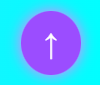
This one's all about quality of life. Once a user scrolls 200 pixels down a page, a back-to-top button appears in the bottom-right corner. It's something subtle but really helpful for pages with lots of content, like my blogs or games list. For accessibility, I made sure the button has enough contrast to be clearly visible, even for users with visual impairments. It's also keyboard-focusable and has aria-label="Back to top" so screen readers can identify it easily.
Card-Based Layouts
The modular card system I used in my Portfolio, Blogs, and Essays sections helps break down content into digestible chunks. Each card includes a title, a short description, and a clickable area to view more. This layout prevents users from being bombarded with a wall of text and makes the site more scannable - especially important for users with ADHD, screen readers, or those using magnification tools. Each card acts like a "mini page preview," giving users full control over what they want to dive into. Structurally, this setup also makes it easier for me to update or add new entries without needing to redesign the entire page.
Navbar
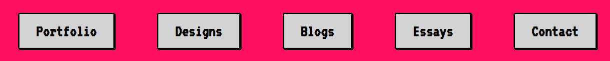
The navbar is the main way users get around my site. It's fixed at the top of the screen and includes links to the five main sections: Portfolio, Designs, Blogs, Essays, and Contact. I've put Portfolio first because it's the heart of the site - it's where potential employers can get a solid look at my skills, background, and the kinds of projects I've worked on. To keep things usable and accessible, I made sure all the links are clear, readable, and keyboard-navigable. I also want to add JavaScript that dynamically applies aria-current="page" to whichever section is active. This helps screen readers announce which part of the site the user is in - a small thing that makes a big difference for accessibility. On top of that, I implemented some scroll behaviour with JavaScript: when a user starts scrolling down, the navbar hides itself to free up screen space. This was especially important for mobile users - on smaller screens, the navbar was taking up way too much space and making it hard to actually see page content. By hiding it while scrolling and showing it again when scrolling up, users can stay focused on what they're reading or exploring without needing to manually dismiss anything. The navbar's visual style also matches the vaporwave theme of the rest of the site, with good contrast ratios and hover effects that help both with aesthetics and interactivity.
Lightbox Gallery
For viewing images (especially in the Games and Fight Stick Designs sections), I implemented a lightbox gallery. When users click on an image, it expands and the background dims, focusing attention on the image. It also disables scrolling in the background, which reduces visual clutter and prevents users from getting lost in the page layout. I included keyboard navigation and made sure images are labeled with alt text so they're accessible to screen readers. It's a feature that not only looks orderly and structured but also improves accessibility and content focus.
Download Buttons

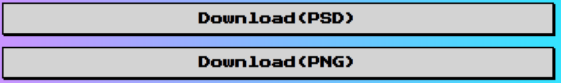
On the Credentials and Fight Stick Designs pages, I included clearly labeled buttons that let users download PDF and/or PSD's. These are styled to stand out and use accessible color contrast and hover effects. I added these because not all users want to browse online - some might prefer or need to save content locally for offline use. The buttons also help employers or collaborators quickly access and save my work without digging through the page.
Highlighting Active Nav Items
To help users keep track of where they are on the site, I added JavaScript that highlights the active nav item - not just based on page, but also on subpage location. For example, if a user is on the "About Me" page, the "Portfolio" nav button stays highlighted. This visual feedback helps all users stay oriented, especially those who might be jumping between multiple sections or using screen readers. It's a small cue, but it improves overall navigation and reduces confusion.
Pagination - Next & Previous Buttons
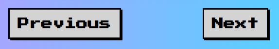
On the individual Blogs, Essays and Designs pages, I added “Next” and “Previous” buttons at the bottom to allow for linear navigation between posts. This supports users who prefer to read content in sequence rather than jumping back to the card selector every time. It's particularly useful for those with cognitive impairments who benefit from simple, consistent navigation paths. The buttons are also large, clearly labelled, and include appropriate aria-labels for screen readers.
Custom Cursor
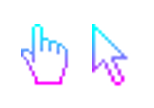
I replaced the default browser cursors with custom .cur files to give the site a more personalised and vaporwave-inspired feel. The neutral cursor is used for general navigation, while the pointer cursor appears over clickable elements like buttons and links. This subtle tweak adds to the retro aesthetic and helps reinforce which elements are interactive in a more stylised way. To further emphasise the visual theme, I implemented a custom trail animation that follows the cursor around the screen. The trail uses neon colouring consistent with the rest of the palette. It adds motion and energy to the user experience without being too distracting, and makes the site feel more dynamic and interactable.
Typing Animation on homepage
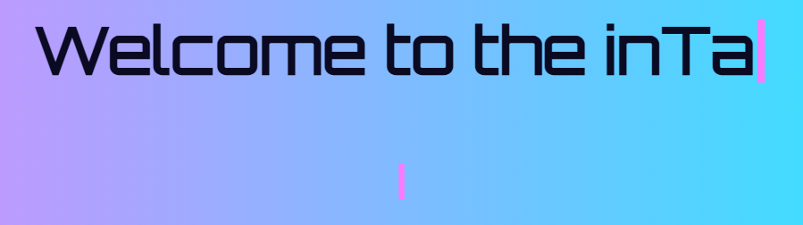
The h1 and h2 on the homepage features a typing animation, where the text appears as if it's being typed out in real time. It's a small touch, but it gives the landing experience a bit of drama and interactivity, drawing attention to the page title while reinforcing the digital/retro theme
A Sketchout Of My UI & An Aesthetic Overview
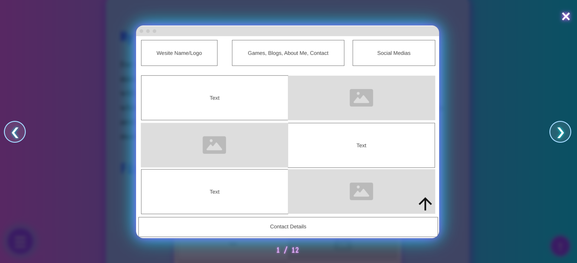
In my earlier wireframes, I originally leaned toward more linear page layouts with multiple filtering options inside hamburger menus. But as I began building, I shifted to a card-based grid structure. It felt more modular, easier to update, and way less cluttered - especially important given the amount of content I had across my designs, blogs, and essays. This layout also improves accessibility: cards create clearer visual breaks and help users - especially those with cognitive or visual processing difficulties - navigate the site more comfortably. My design process started with looking at existing portfolio sites and noting how they structured information. From there, I built wireframes based on what I liked and what suited my content. But I quickly realized that because I had way more content than most portfolios, my initial layouts were too dense and inefficient - so I adapted. The vaporwave aesthetic was a personal choice. While it's not a conventional look for a portfolio, it reflects my creativity and personality. Vaporwave brings a nostalgic, calm-yet-rebellious energy that aligns with how I see the world and how I approach design. I tried to channel those feelings into the interface itself - balancing bold visuals with a structure that's user-friendly and intuitive.
Fonts - Readability and Legibility
I've stuck with the same font choices since the beginning of the project because they both suit the aesthetic and serve different content purposes well. For h1 elements, I use Orbitron, which has a futuristic, digital look that fits perfectly with the vaporwave theme. For h2, I went with VT323, a pixel-style font that brings retro computer terminal vibes - again, leaning into the aesthetic without overwhelming the design. Finally, for body text, I use Lora, a serif font that contrasts well with the headers and is much easier to read, especially for longer text blocks like blogs and essays.
I specifically chose Lora because it's accessible - it has strong letterform clarity and works well even for users with mild vision impairment or visual fatigue. I also adjusted spacing based on content density: in areas with less text, I increased line spacing to make the content feel light and easy to follow, while in longer sections, I kept spacing tight but balanced to reduce unnecessary scrolling without compromising legibility. Overall, I wanted to keep the vaporwave aesthetic strong without sacrificing clarity - especially since my site includes a lot more written content than a typical portfolio. These fonts helped me do that.
Colours
I've continued using the same primary colour palette throughout the site:
- Neon Pink #FF77FF - a bold, bright pink that captures the nostalgic neon vibe of the 80s.
- Electric Purple #9B4DFF - a vibrant purple that complements the pink and adds a futuristic energy.
- Aqua Blue #00FFFF - a cool, calming cyan that keeps within the neon aesthetic but provides contrast.
Recently, I added #FF0F5F - a strong pinkish red - to improve contrast and draw attention to specific elements where the original palette was harder to read. I chose this new colour deliberately with accessibility in mind, as it offers better readability while still fitting within the vaporwave aesthetic. For important text and interface elements, I stick to black or white to ensure maximum clarity. The coloured elements are mostly used for highlights, accents, and to add visual interest without compromising legibility.

Composition
To establish visual hierarchy, each h1 heading is enlarged to clearly indicate the current page, helping users instantly understand where they are. Body text is sized for readability while maintaining efficient line spacing to avoid clutter. I also use hr tags to divide sections, adding visual order and structure. My colour choices are intentionally high-contrast to emphasise key elements like headings, ensuring they stand out. In addition to visual cues, I incorporated JavaScript-based accessibility features such as a dynamic navbar highlighter, a "back to top" button, and a collapsible hamburger menu, all of which support easier navigation - especially for users on smaller screens or with visual impairments.
Interface Elements - Visual Representations
Most of my interface elements follow a consistent shape language: rounded rectangles. This design choice conveys a sense of friendliness while maintaining a sense of structure and modularity across the site. The exception is my navbar, which uses hard-edged rectangles inspired by retro Windows call-to-action buttons. This choice not only strengthens the vaporwave aesthetic but also makes the navbar visually distinct across all pages, helping users consistently identify navigation controls.
To guide users' attention and make interaction more intuitive, I've used colour and glow effects on interactive elements. Cards and links, for example, light up or shift colour on hover, giving users clear visual feedback. The navbar buttons also include back shadows, creating a pseudo-3D look that echoes classic OS designs and makes the buttons pop from the page. All elements have been placed in conventional, expected positions to minimise confusion and improve learnability. The navbar is fixed at the top, the "Back to Top" button sits in the bottom-right corner, and pagination buttons appear at the bottom of blog and essay pages - these placements follow familiar web UI patterns, making the site easier to navigate, especially for users with cognitive or visual challenges. Subtle transitions and hover animations across elements help reinforce the overall aesthetic while supporting accessibility through visual clarity. These visual cues are not just decorative - they help users understand what can be interacted with and where they are in the navigation flow.