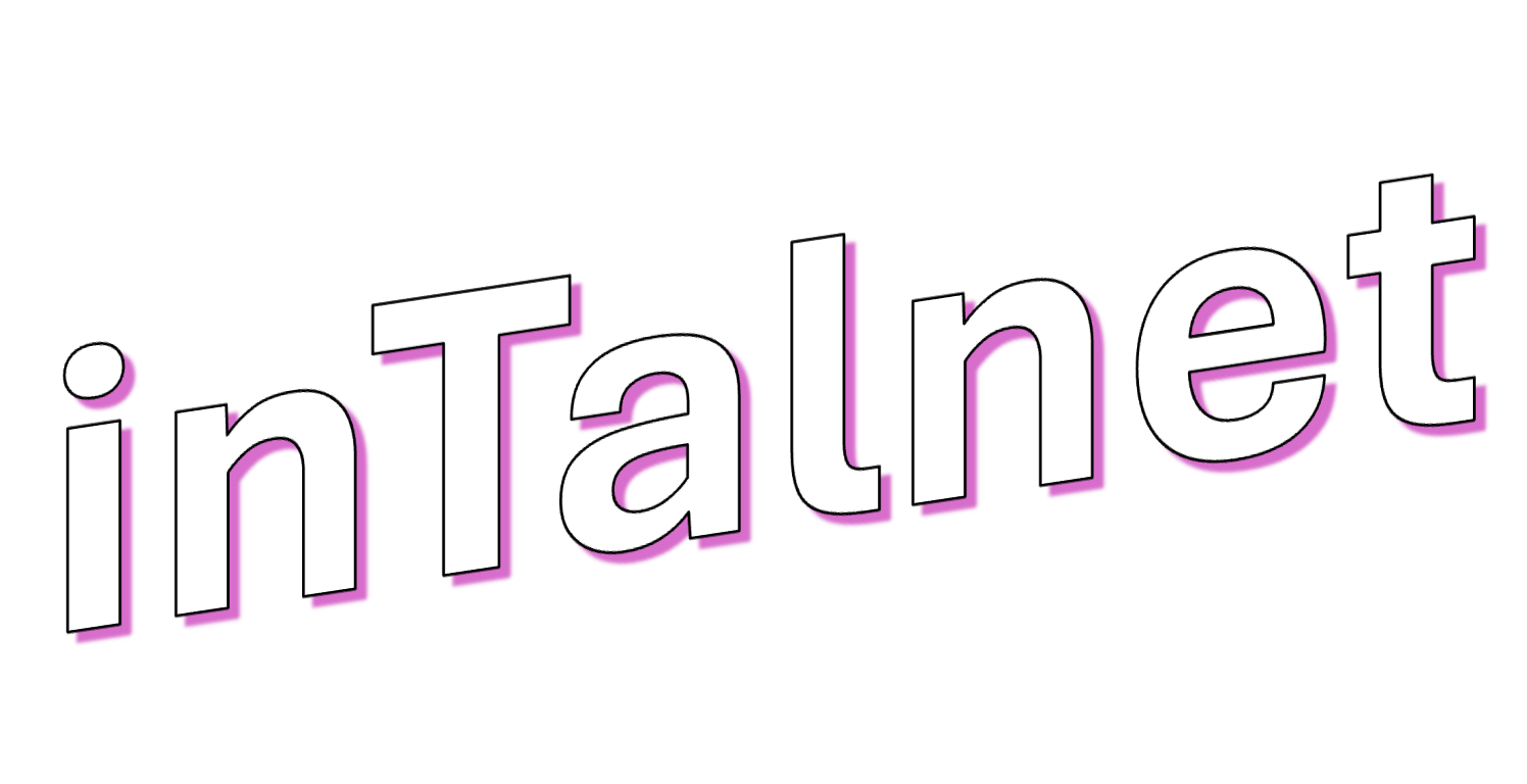
Backgrounds
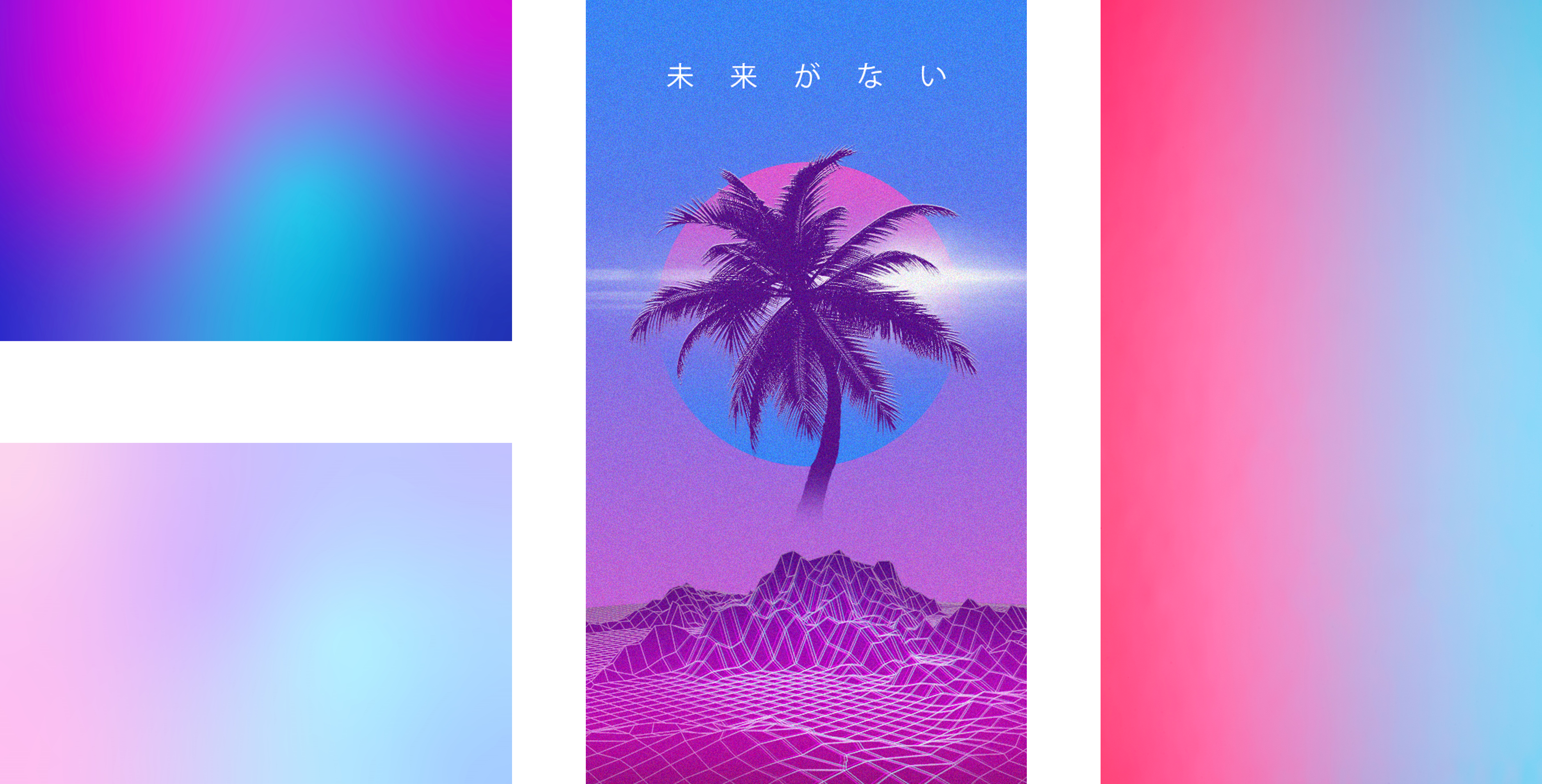
These backgrounds are all gradients using the Vaporwave colour palette. The colours compliment each other by creating nostalgic and retro vibe. The blue, red and pink shades are bold yet synthetic and emotional.
Buttons
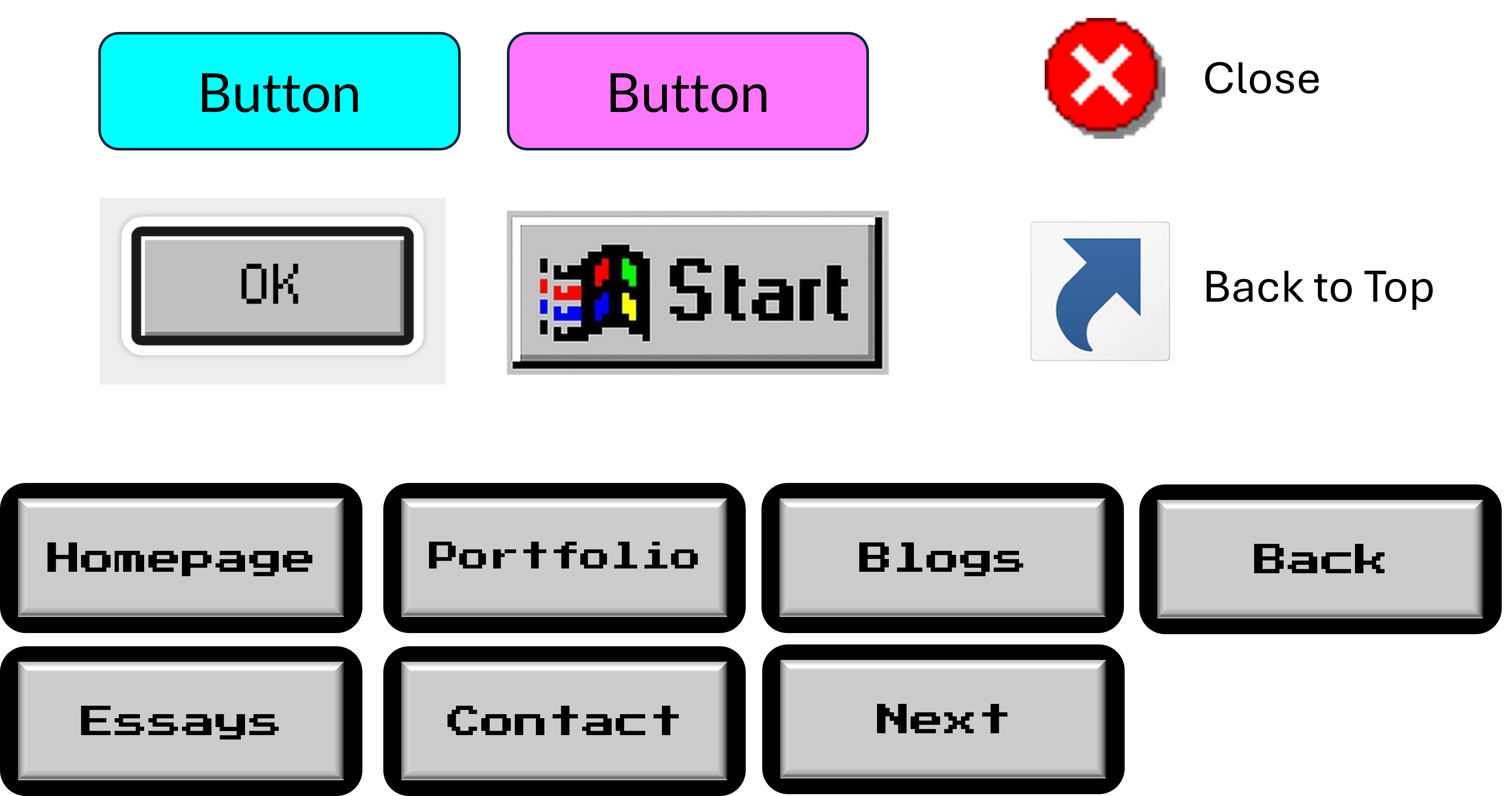
I have designed the buttons to emulate old retro Windows and video game buttons. Certain icons such as the Windows shortcut icon and the Windows XP 'X' icon, will be repurposed to allow a user to move to the top of the webpage and to close the nav bar or something similar respectively.
Button States
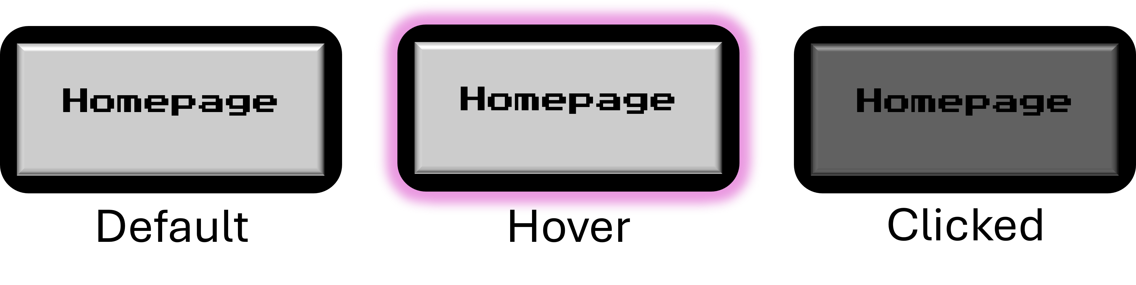
Buttons will be in one of three various states depending on the action of the user. The default button will simply appear light gray in colour. When hovering over a button, it will glow in purple to enhance it and assist in visual aid. When a button is clicked, it will temporarily appear darker in colour. This helps the user see that they have not accidentally pressed the button.
Card States
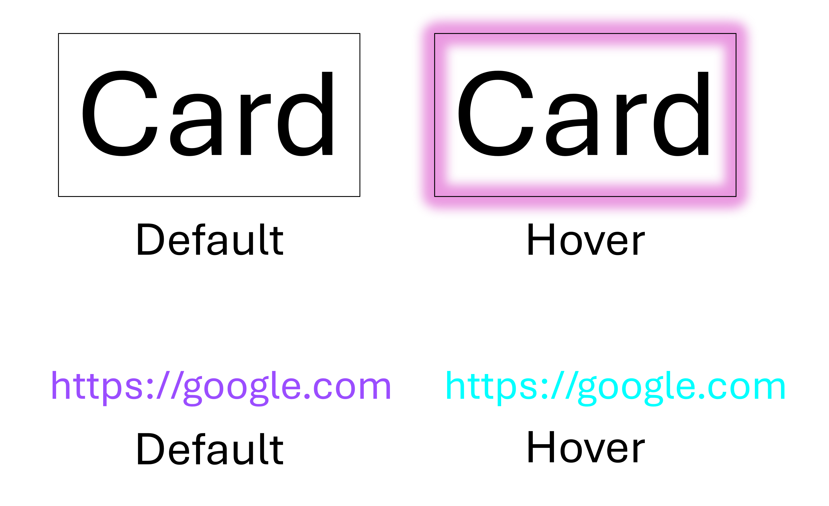
Similar to buttons, all cards and links will also have their own default and hover states. When hovering above a card, it will also glow in purple such that the user is told When they can potentially click on it. When hovering above a link it will also be changed in colour to reflect that it can be clicked on.
Font Sizes
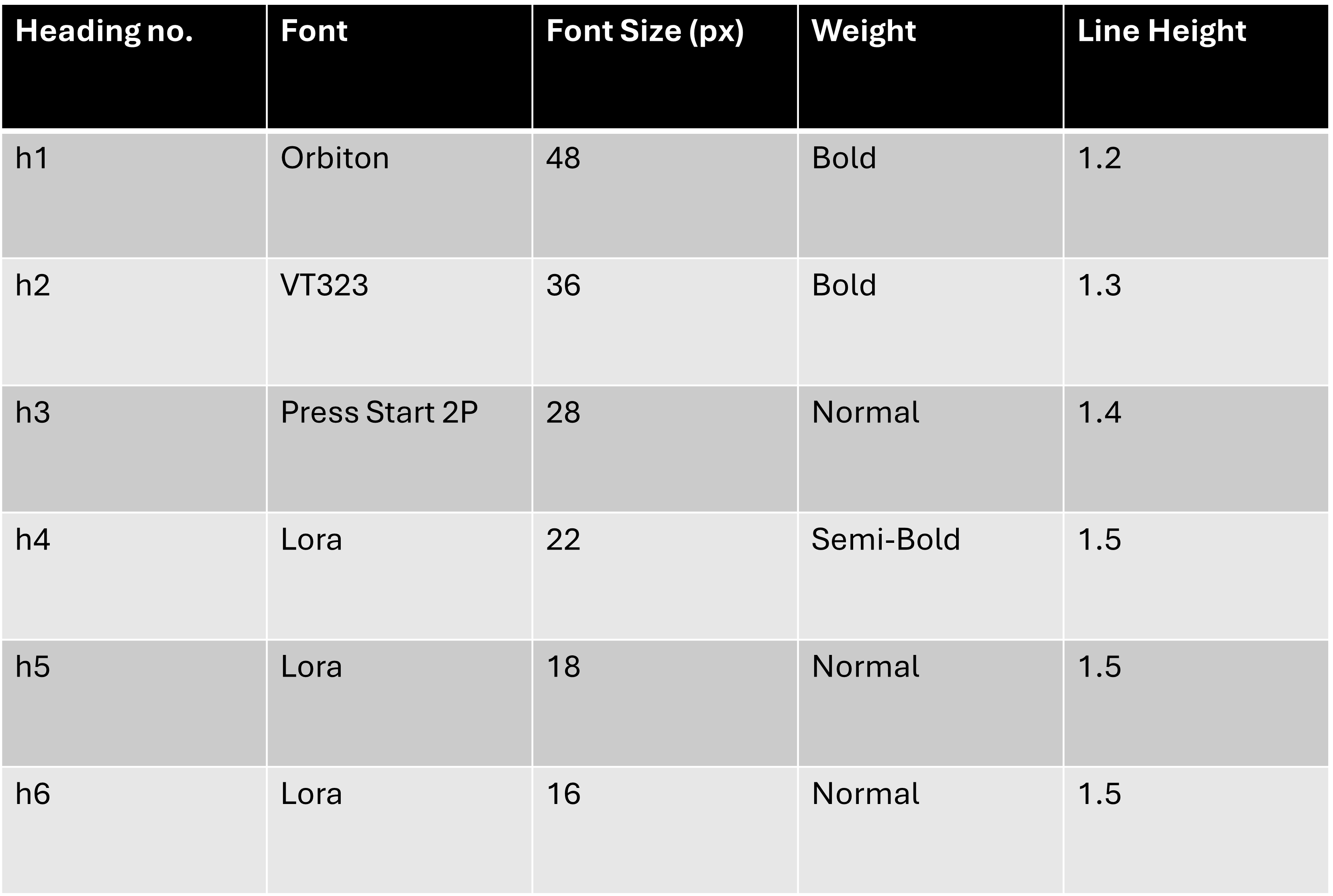
This table outlines the font sizes used across headings and body text on the website. Establishing a clear visual hierarchy helps guide users through content intuitively—making it easier to scan, read, and understand. Larger headings like h1 and h2 grab attention and define the page structure, while smaller elements like h5, h6, and body text maintain consistency and readability. Spacing, alignment, and size all work together to create a clean, organized layout that supports both usability and aesthetic.
Music Player
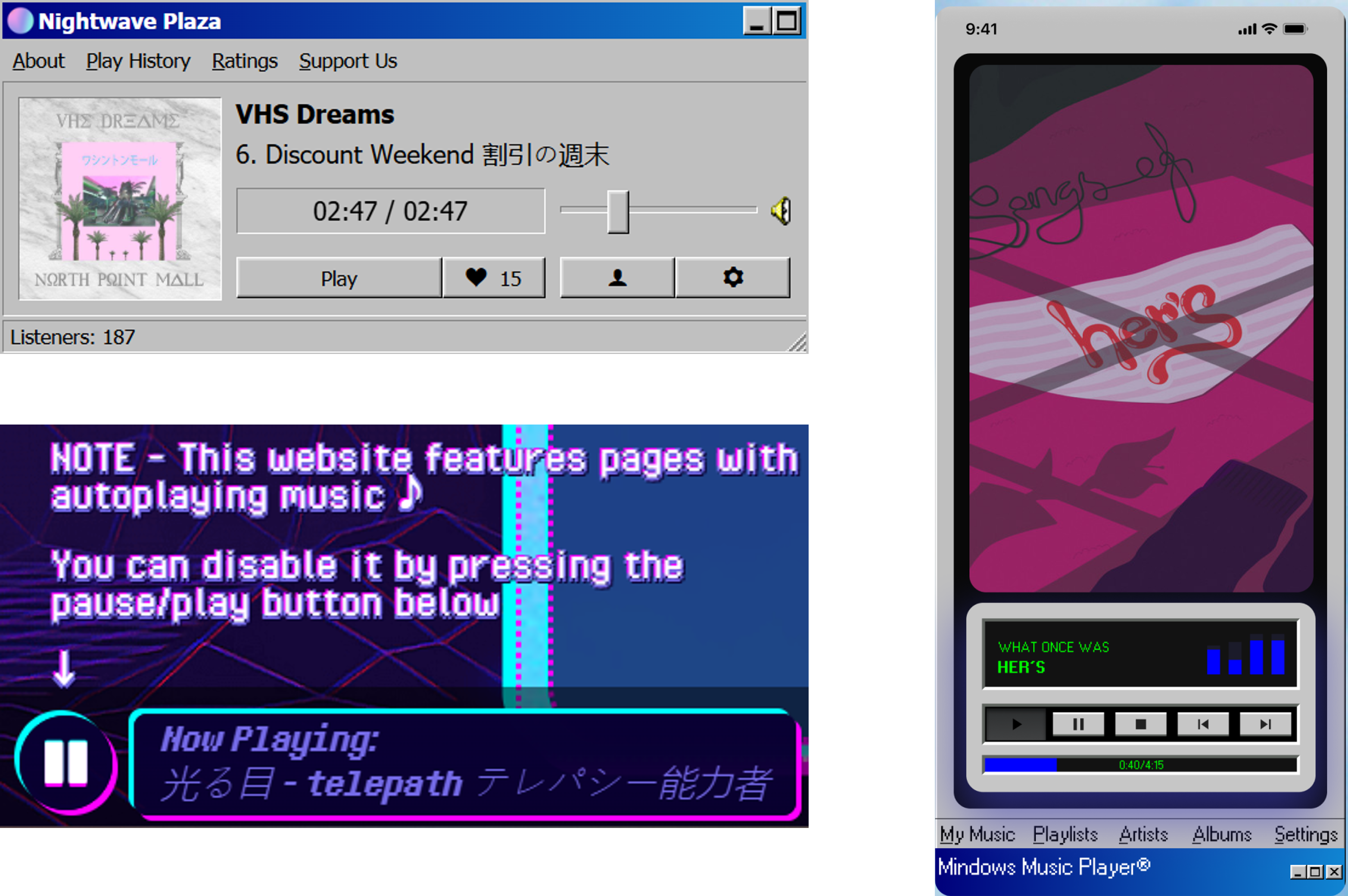
The music player adds an interactive and atmospheric layer to the homepage. It features a minimalist design with basic audio controls (play, pause, volume) and fits seamlessly into the vaporwave aesthetic of the site. The audio complements the visual style, immersing visitors in a chill, retro-futuristic vibe from the moment they land on the page.
Updated Wireframes with Navbars
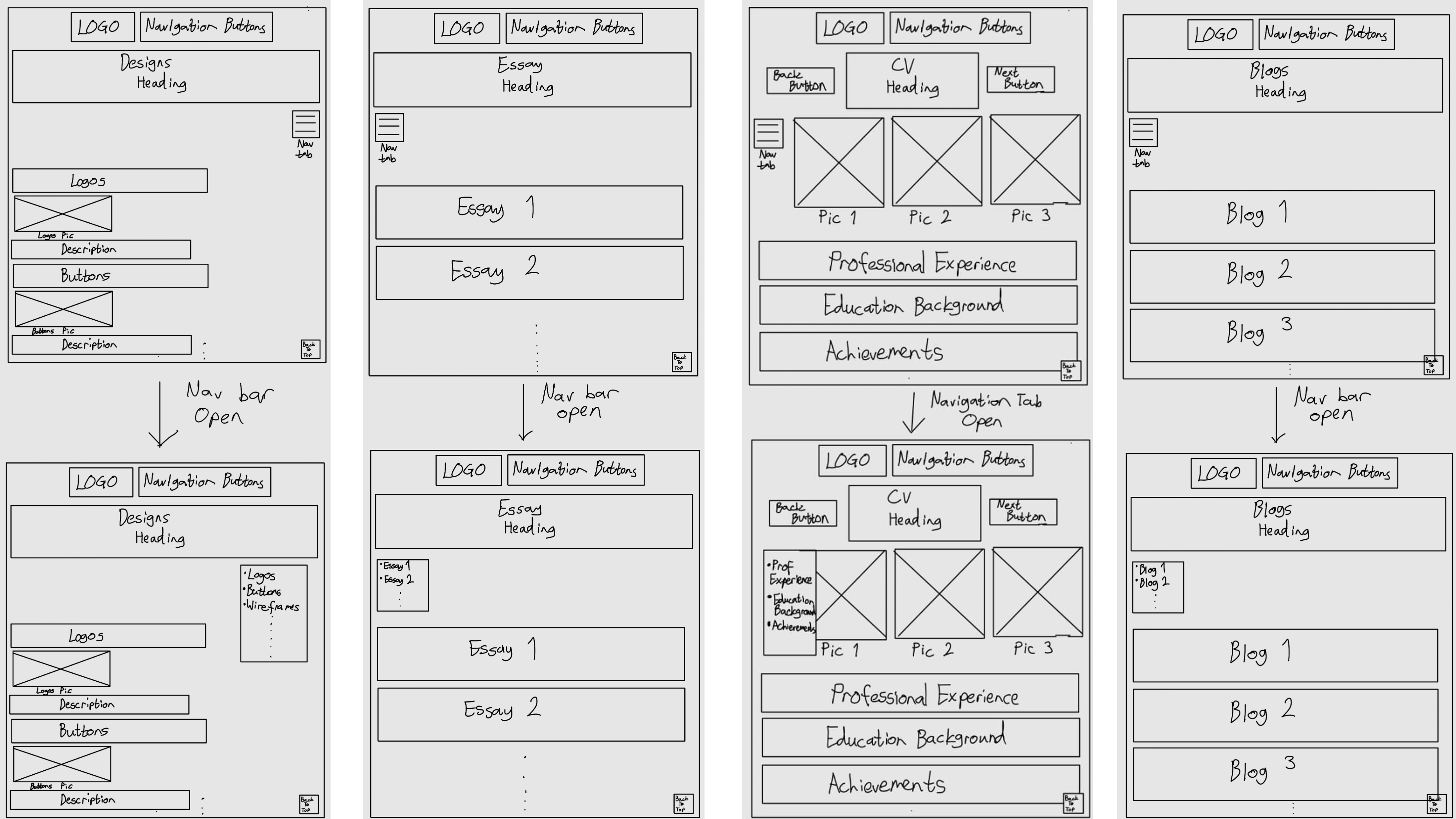
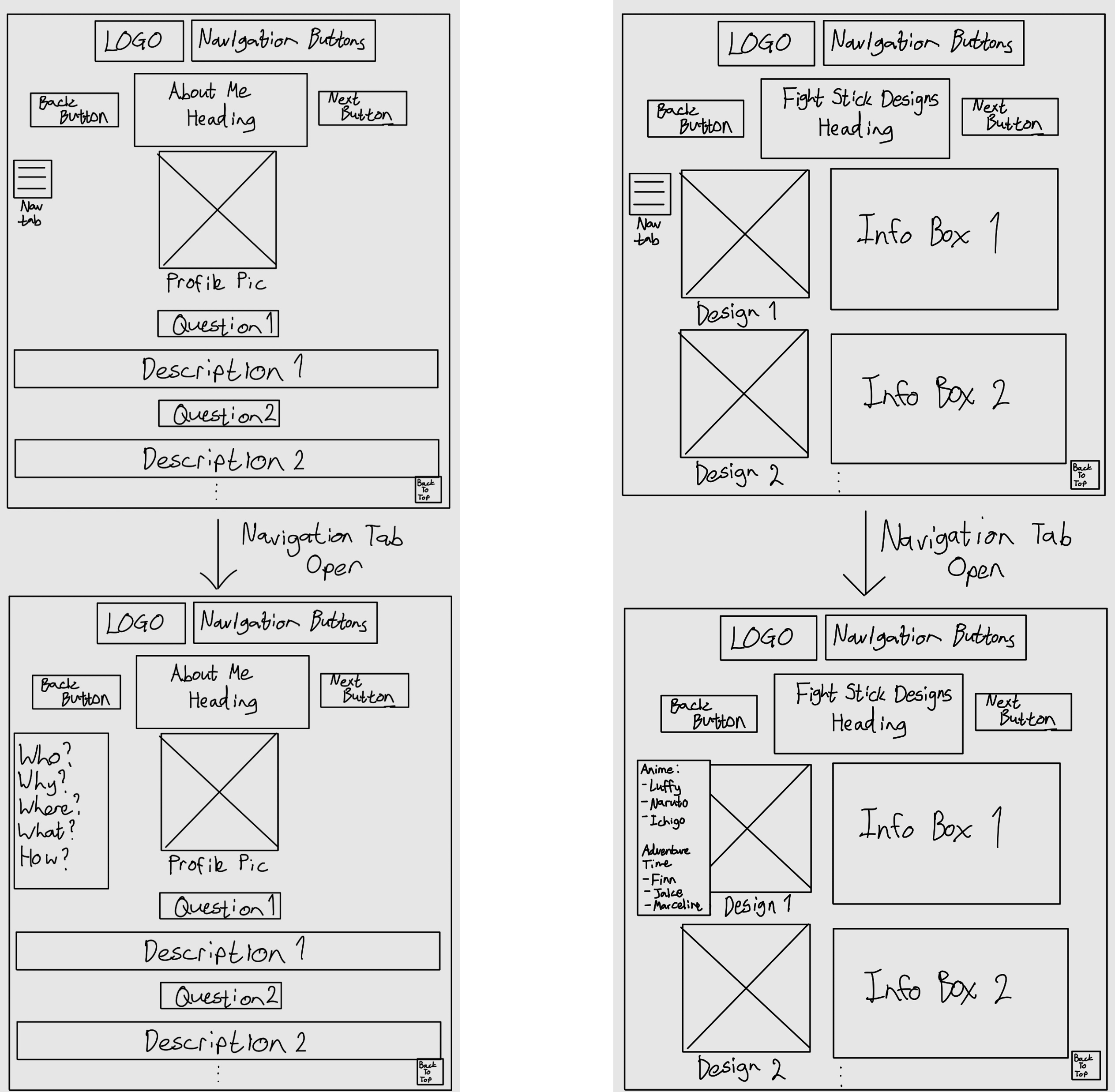
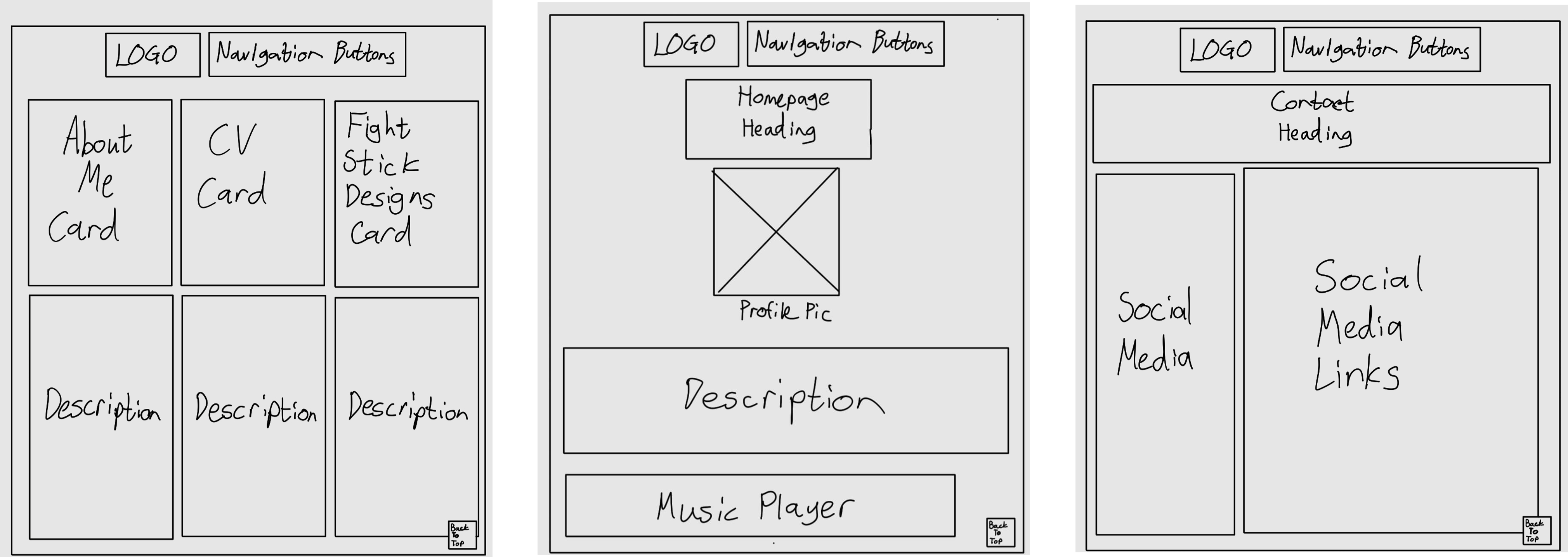
These wireframes now include the addition of a Navbar on select webpages. This allows for easy navigability as users do not need to scroll through an entire webpage to find a single thing they are looking for. There is also more annotation allowing for greater detail within the actual pages.
Spacing and Alignment
Alignment Rules
- Main Headers: Centered or Left-Aligned
- Subheadings and Body: Left-Aligned for readability
- Buttons and CTAs: Centered or aligned with specific content
Spacing
- Section Spacing: 60px top and bottom between major sections
- Element Spacing: 20-30px between text and images, or buttons
- Grid Layout: 12 Column responsive layout