
My Style Process
For my website's visual style, I'm aiming for a vaporwave aesthetic that combines minimalism with vibrant colours and retro imagery. Vaporwave is often associated with geometric shapes like squares and polygons, representing my engineering side, while the colourful palette reflects my creative side in digital art and game design. This aesthetic allows for an engaging visual experience while maintaining a clean and modern design.
First Wireframe
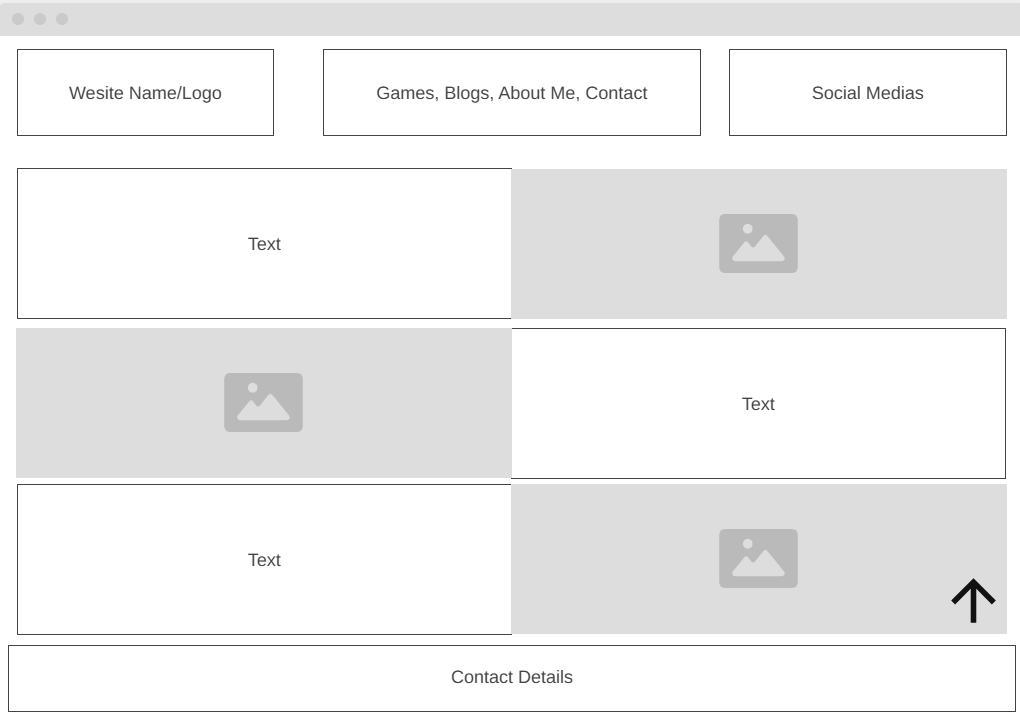
This is my first wireframe design for the homepage. It is a minimal and structured layout, focusing on easy navigation rather than information overload. At the top, I have included my logo, navigation buttons, and social media links for quick access. The rest of the page consists of basic text and images, keeping it visually clean while directing users toward the key sections of my website. Since the homepage serves primarily as an entry point, most of the detailed content is housed within the five primary webpages. However, I am considering adding animations or interactive elements to enhance engagement and create a stronger first impression. My goal is to strike a balance between simplicity and a visually appealing design that immediately captures the visitor's attention.
Webpage Wireframes
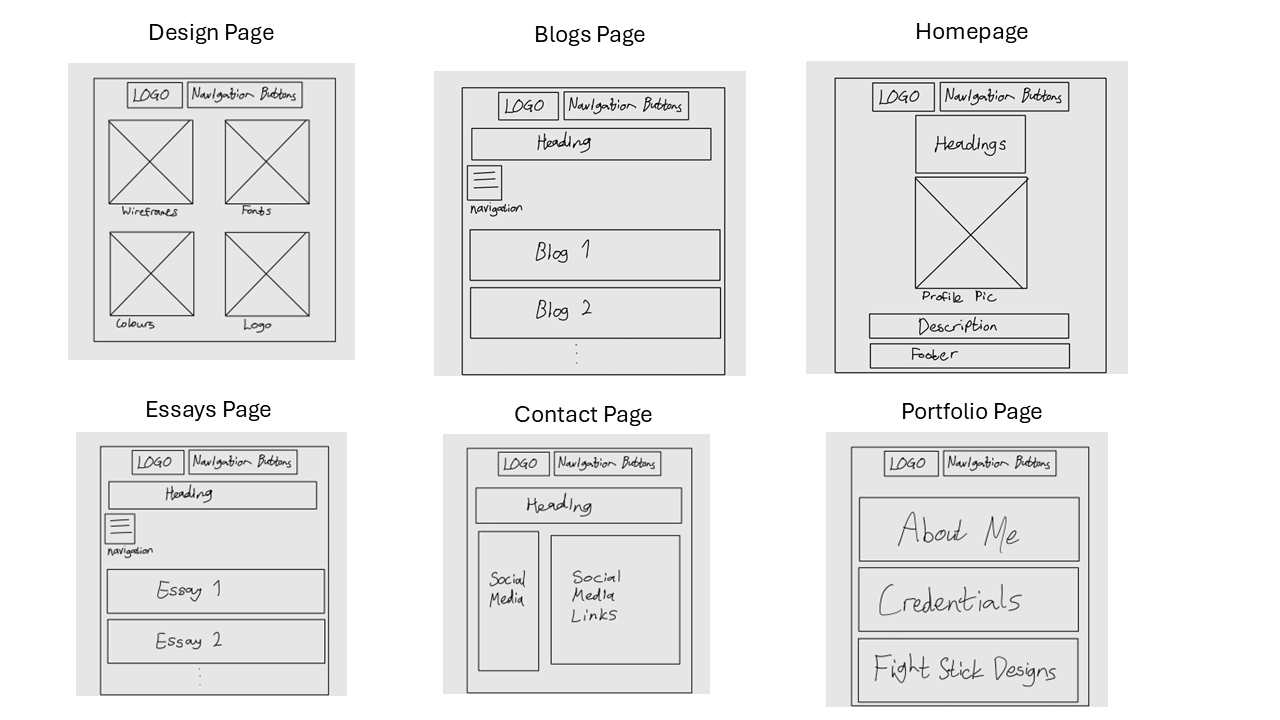
The Design page, which you are currently viewing, is structured into individual sections, each focusing on a specific design element. This modular layout enhances navigation, allowing visitors to easily find the aspects they are most interested in. Additionally, this structure makes future updates and edits to the page more efficient and manageable. All blog posts will be displayed on a single webpage, rather than being separated into individual pages. This decision was made to eliminate loading times and improve navigability, allowing users to scroll seamlessly through posts in chronological order. To enhance accessibility, a navigation tab will enable users to quickly jump between different blog entries. The updated homepage features a photo of myself alongside a brief description. I plan to incorporate additional engaging elements in the future to make this page more dynamic. In this revision, I have removed the social media buttons and contact info from my previous wireframe. Instead, all contact details and social links will be consolidated into the Contact page, ensuring they are presented in a single, convenient location. The Essays page will mirror the structure of the Blog page, displaying all essays on a single, scrollable webpage. Like the blogs, a navigation tab will be included to help users jump between different essays efficiently. The Contact page will provide a list of my preferred communication methods, each accompanied by a direct link to the respective platform. This ensures that all contact details are easily accessible in one place, rather than being scattered across different sections of the site. The Portfolio page serves as a central hub, directing visitors to three other sections: About Me, which provides a deeper look into my background and journey; Credentials, showcasing my skills, education, and qualifications; and Fight Stick Designs, a gallery of my custom fight stick artwork. Each of these sections will be hosted on a dedicated webpage, ensuring a focused and well-structured presentation of my work.
Portfolio Webpage Wireframes
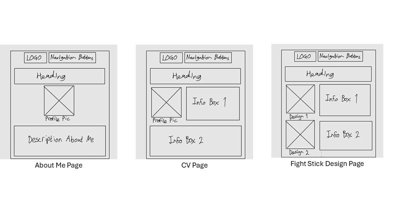
These are the wireframes for the 3 sub-webpages of the Portfolio page. The about me page contains the least amount of detail as it is simply a brief description of myself and has been tailored to be more personal. The CV page will be structured as a professional CV or resume with my image in the top left of the page and info relating to my qualifications and experience filling up the rest. The fight-stick design page will include each piece of fight stick art I have created with some info on each design to the right of each image.
Logos
The two logos align with the vaporwave aesthetic, incorporating both color and asymmetry to enhance the design. There are two versions: a colored pink variant and a white version. The logo will be positioned at the top left corner of every webpage and will function as a clickable element, allowing users to return to the homepage.
Colour Palettes
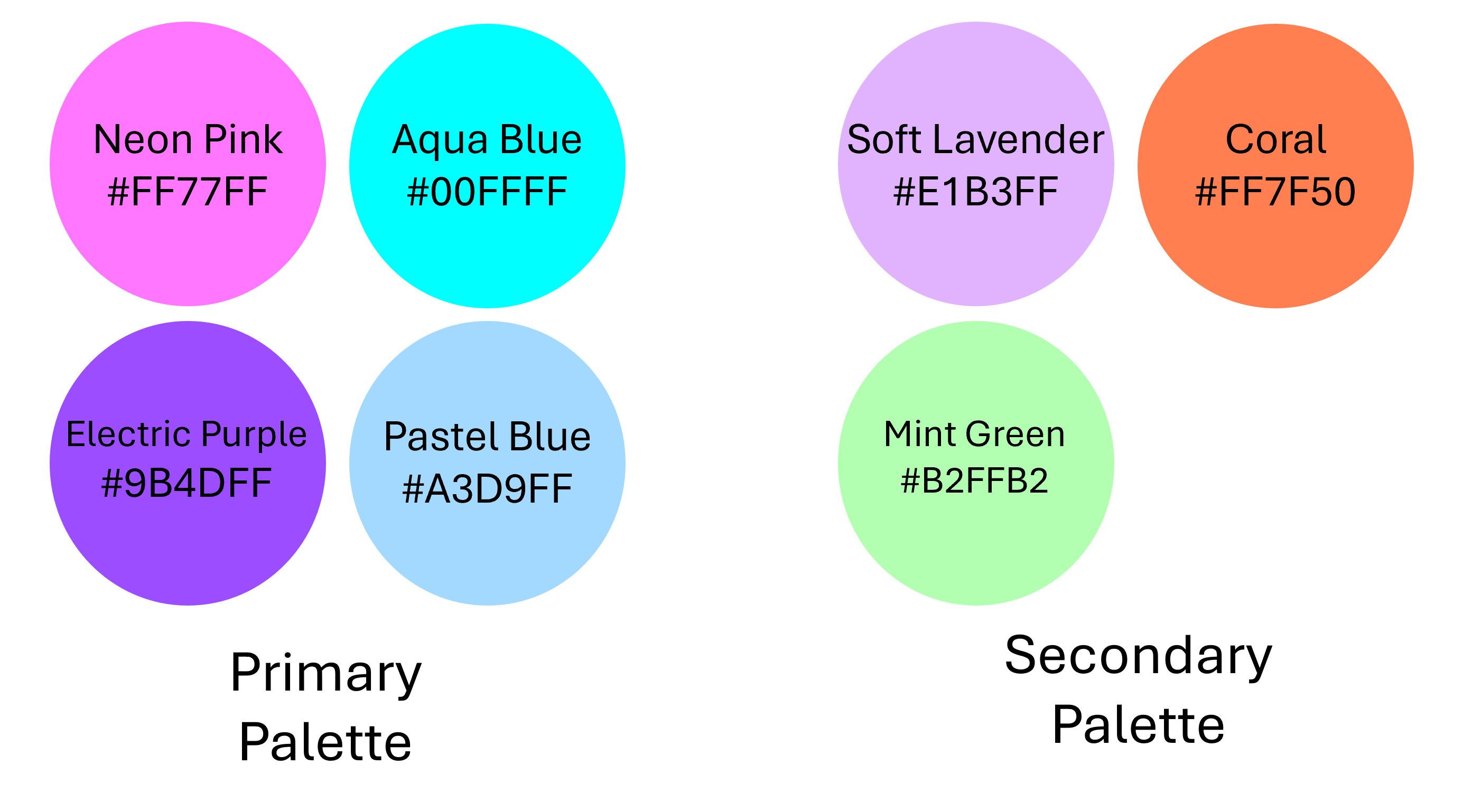
The colour scheme will evoke nostalgia for the 80s and 90s, blending bold neon hues with softer pastels to create a retro-futuristic vibe. The main palette will include Neon Pink (#FF77FF) - a bright, bold pink that feels very retro and gives off the nostalgic neon vibe of the 80s, Electric Purple (#9B4DFF) - a vibrant purple that pairs well with neon pink and gives off a futuristic energy, Aqua Blue (#00FFFF) - a bright cyan that brings a cool, calming effect while still staying within the neon aesthetic, and Pastel Blue (#A3D9FF) - a softer blue that can add balance and make the design feel less overwhelming, with secondary accents like Soft Lavender (#E1B3FF) - a subtle purple tone that complements neon pinks and blues, keeping things light and airy, Coral (#FF7F50) - adds a slightly warmer tone and contrasts nicely with the cool blues and purples, and Mint Green (#B2FFB2) - a light, refreshing green that contrasts with the more intense colors but fits the vaporwave mood to add variety and balance.
Fonts
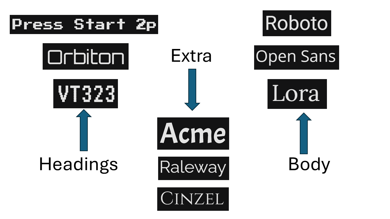
The fonts will include retro, bold, and digital styles for headings, such as VT323, Orbitron, and Press Start 2P, which capture the nostalgic, digital feel of the vaporwave culture. For body text, I'll use clean and readable fonts like Roboto, Lora, and Open Sans, ensuring the site remains user-friendly while still fitting the aesthetic. Additional fun fonts like Raleway, Cinzel, and Acme may be used for accents, keeping the design playful and on-brand.
Buttons
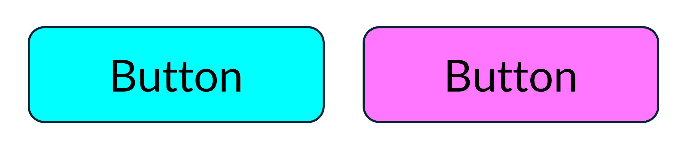
The button designs follow the vaporwave aesthetic, featuring two colour variations: blue and pink, which complement the overall visual theme of the website. The rounded corners create a softer, more inviting look, enhancing the retro-futuristic feel associated with vaporwave design. These buttons are designed to be both visually appealing and functional.
Icons
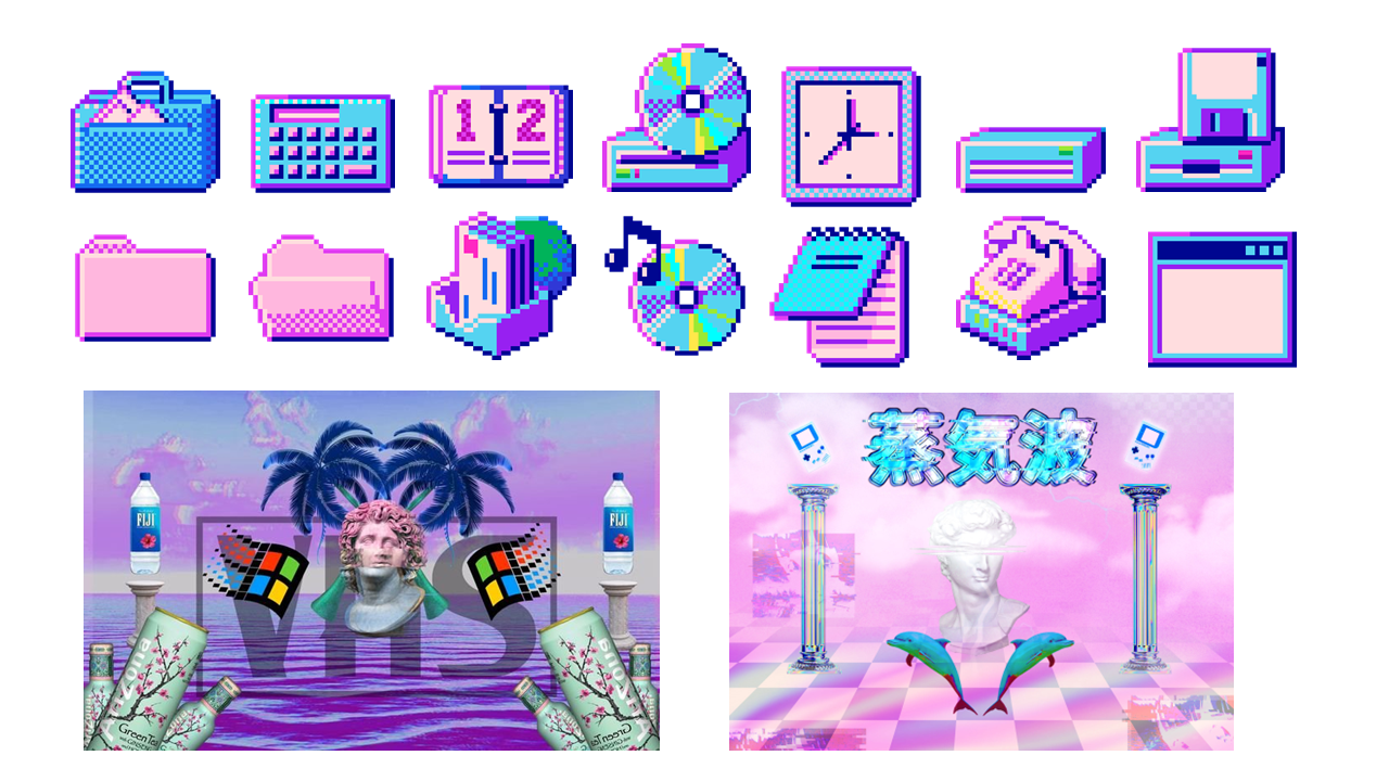
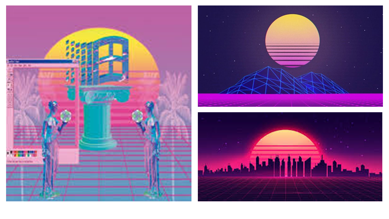
My website's visuals are inspired by the vaporwave aesthetic (as mentioned earlier), using icons and imagery that define the style. This includes retro technology like CRT monitors, cassette tapes, and old computer graphics, creating a nostalgic, digital feel. Beaches, palm trees, and neon sunsets add a dreamy, futuristic vibe, while Greek architecture and classical sculptures bring in the mix of old and new that vaporwave is known for. These elements help make the site feel unique, immersive, and true to the aesthetic I want to create.
Extra Features
I'm enhancing my vaporwave-themed portfolio with some cool interactive features to make the experience more immersive and nostalgic. One of the standout elements will be draggable windows styled like old-school file tabs, complete with functional maximize, minimize, and close buttons for a retro desktop feel. To add depth, I'm incorporating a parallax scrolling background featuring neon sunsets, grids, and classical busts, creating a dynamic, layered effect as users scroll. A retro music player will loop a chill synthwave track in the background, with a simple play/pause button built using the HTML audio tag and JavaScript for seamless control. To make the site even more engaging, I'm adding a fun Easter egg—pressing the Konami Code will trigger a hidden animation or unlock a secret page, bringing an extra touch of nostalgia and interactivity. These features will blend aesthetic appeal with functionality, ensuring my portfolio not only showcases my work but also reflects my passion for design, gaming, and digital art.
More Reference Material
My Site Inspirations
https://ne0nbandit.neocities.org/ | https://plaza.one/ | https://voodu.xyz/homepage | https://neocities.org/browse?tag=vaporwave
Mock Group Style Guide
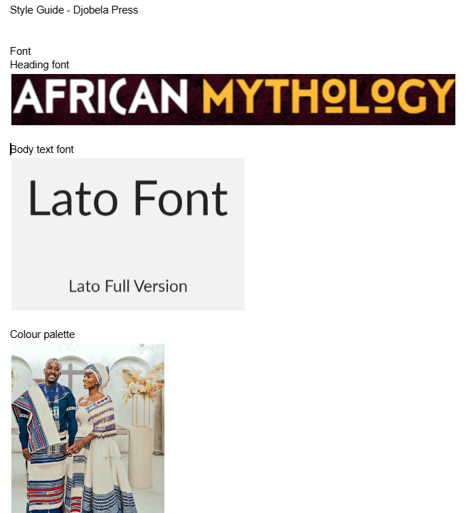
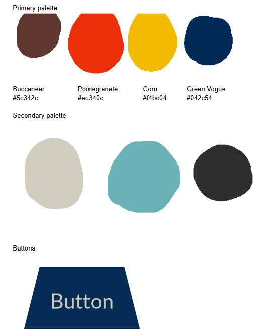
My group and I had the opportunity to create a style guide for high-fantasy author Mava, whose trilogy, Djobela's Guardians, is inspired by Xhosa mythology, featuring Qamata and the Great Sea Dragon. With two books published and a third on the way, the brand celebrates African folklore woven into fantasy literature. For the headings, we selected a bold, rounded font for its strong yet smooth appearance, with the accents below the "o" characters reinforcing the mythology theme and tying into the Xhosa cultural influence of the story. For the body text, we chose Lato for its clarity and readability, ensuring a comfortable reading experience. The color palette draws inspiration from traditional Xhosa dresswear, incorporating pomegranate, corn, and green vogue, while buccaneer (earth tones) and turquoise represent the Great Sea Dragon. Light and dark greys were also included to enhance contrast and highlight key design elements. Lastly, our button design takes the shape of a trapezium, inspired by Table Mountain, which is central to the legend of the Great Sea Dragon, further connecting the visual identity to the mythology at the heart of the trilogy.