
Clicks, Carts, and Chicken: Which Site Gets My UX/UI Vote?
When analysing UI and UX, it's going to be important for me to select a website that provides enough depth for discussion. For my essay, I'm considering three South African websites: Nexus Hub, Nando's, and Makro. Each presents unique opportunities and challenges for analysis. I'll explore the pros and cons of each choice below.
1. Nexus Hub
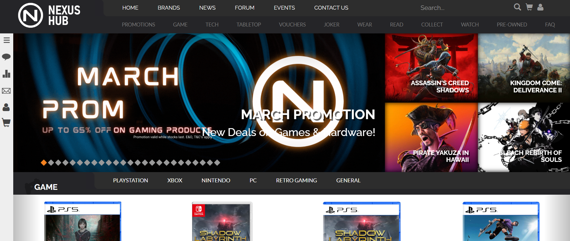
Nexus Hub is a website focused on gaming, collectibles, and pop culture, featuring news, reviews, and an online store. They also have a physical retail store in Randburg, featuring similar stock to their online store.
Pros:
- Diverse Content and Features: The site combines news articles, reviews, chats and an online shop, providing a multifaceted UX experience.
- Structured Layout: The interface balances editorial content (news articles and forums) and retail products, making navigation between the two relatively seamless.
- Community Interaction: Features like forums, chats and polls enhance user engagement through posting, commenting and sharing opinions and/or interesting information.
Cons:
- Cluttered Interface: The homepage can feel overwhelming with multiple sections competing for attention as well as certain elements being very small and difficult to read.
- Navigation Issues: Some elements, such as filtering products or finding specific content, could be more intuitive. The primary navigation bar is also split into 2 sections making it significantly more unintuitive to use.
- Potential Performance Concerns: Large amounts of media/content may slow down page loading times.
2. Nando's
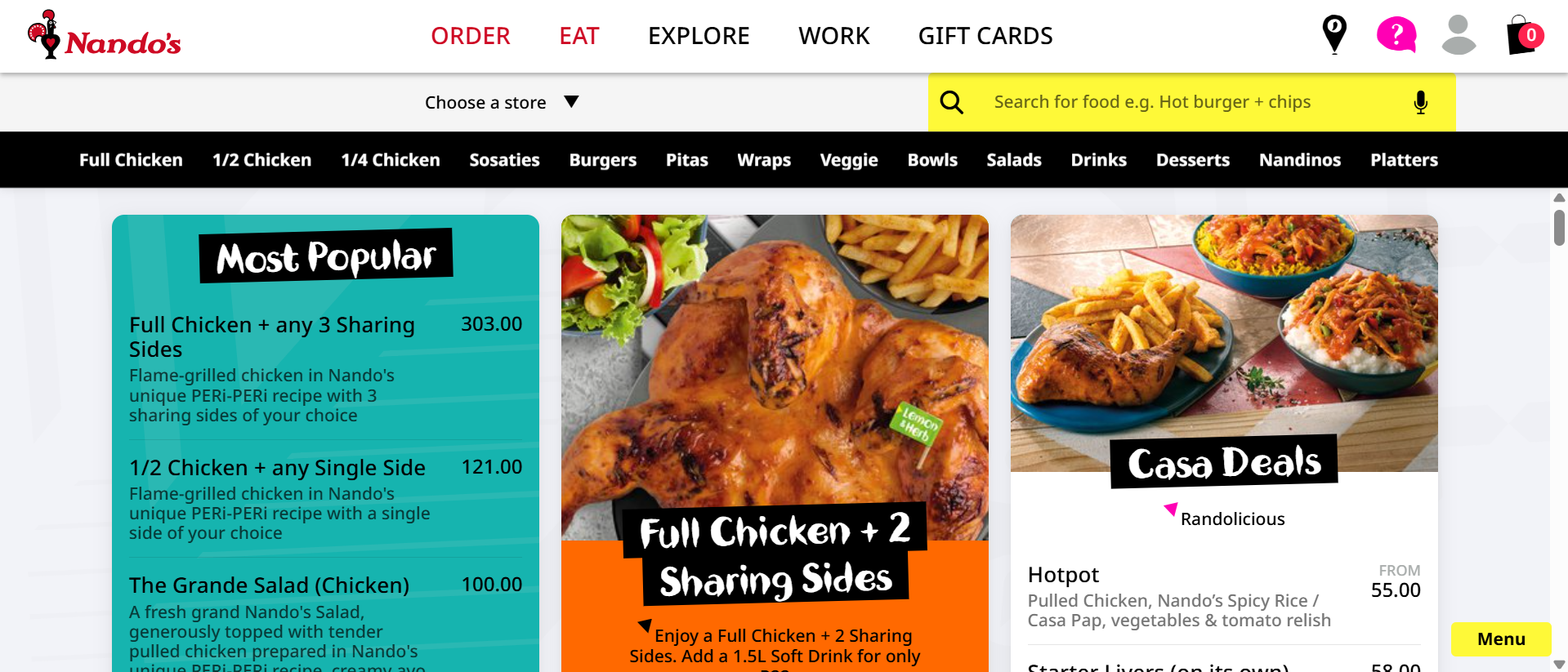
The Nando's website serves as an extension of the restaurant chain, offering menus, store locators, and online ordering.
Pros:
- Strong Brand Identity: The site maintains Nando's signature playful and vibrant design.
- Interactive Elements: Features like menu navigation and restaurant locators are engaging and visually appealing.
- Clear Call-to-Actions: Ordering food online is straightforward with well-placed buttons and a clean layout.
Cons:
- Limited Depth for UX Issues: Since it's a relatively simple site, there may be fewer complex UX problems to discuss.
- Inconsistent Load Times: Some pages, especially those with high-resolution images, can take longer to load than expected.
- Lack of Unique Features: Compared to global food chains, Nando's site doesn't offer much in terms of innovative UI/UX interaction.
3. Makro
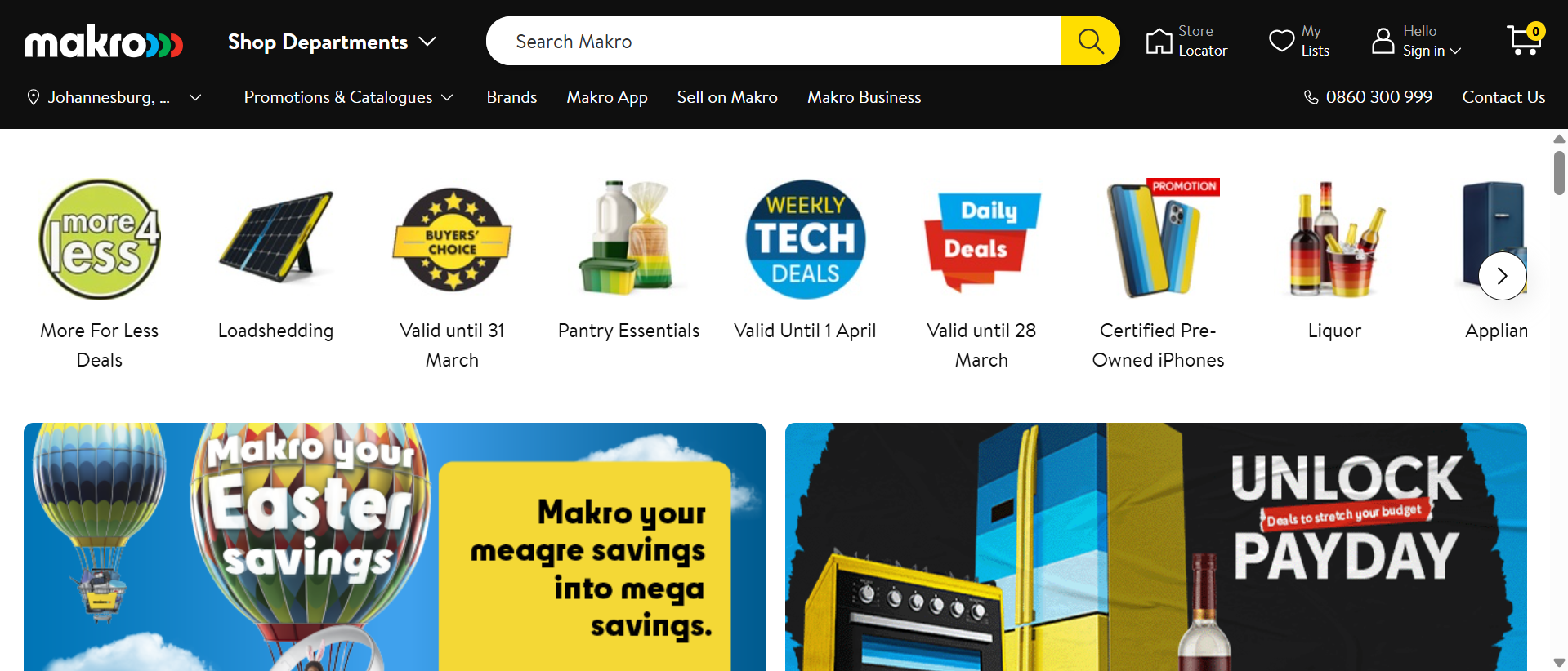
Makro is a major South African e-commerce site offering bulk goods, electronics, and groceries.
Pros:
- Comprehensive E-commerce Features: The site includes search filters, user accounts, and an online checkout process.
- Mobile Optimization: Works well across different devices.
- Wide Range of UX Elements to Analyse: As an online store, it provides opportunities to explore usability, accessibility, and customer experience.
Cons:
- Cluttered Layout: The sheer volume of products and promotions can make navigation overwhelming.
- Performance Issues: The site can sometimes feel slow, especially when filtering products or checking out.
Summary:
Each of these websites offers a different perspective on UX and UI design. Nexus Hub provides an opportunity to analyse a hybrid content platform combining news articles and an online retail store, Nando's is a strong example of branding and interaction, while Makro presents a more typical e-commerce experience. At this point in time, I have heavily considering