Refining My Website: Design, Accessibility, and Future Improvements
As we continue learning about Interaction Design (IxD), User Experience (UX), and User Interface (UI) processes, I am now focusing on developing my site's overall structure rather than just its physical content in HTML. The way a website is designed plays a crucial role in how it is perceived, so I am putting considerable thought into this aspect.
Navigability and User Experience
My favourite websites are those that strike a balance between accessibility and functionality. They present information efficiently while ensuring smooth navigation. I appreciate sites that incorporate call-to-action elements without excessive loading times between interactions. Inspired by this, I plan to structure my website so that more content is available on a single page, minimising the need for users to navigate back and forth. To maintain clarity, I will incorporate dropdown menus and navigation bars, making it easier to find specific sections without overwhelming the user with too much information at once. This approach ensures a seamless experience while reducing frustration caused by excessive page loads.
Aesthetic Choices and Branding
Since this is a CV/portfolio website, it is essential that information about my qualifications, projects, and personality is easily accessible to potential employers. I am aiming for a minimalistic aesthetic while incorporating a vaporwave-inspired colour palette.
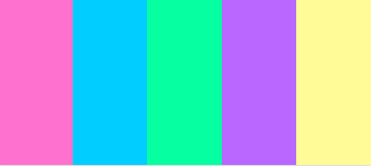
Rather than adopting vaporwave's abstract UI elements, I am primarily focusing on its colour scheme—soft blues, pinks, purples, and greens as primary colours, with yellows and oranges as secondary accents. This combination allows me to create strong contrast, ensuring readability while also conveying a warm and inviting atmosphere. I believe these colours reflect both my technical and artistic sensibilities.
Accessibility Considerations
To improve usability, I will use large text and buttons. This makes navigation easier for users who may not be tech-savvy or have difficulty with precise mouse movements.
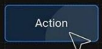
Additionally, my button designs will be neutral in shape—professional yet friendly—to reflect my serious approach to my career while maintaining an approachable personality.
Reflection on my Initial Wireframes
Looking back at my original wireframes, I now have a much clearer vision of my website's design. While the homepage structure remains similar to my initial concept, I will be incorporating more information and visuals to enhance engagement. My style guide is still in progress, but my design choices are now more intentional and aligned with my goals.
Challenges and Achievements
One of my biggest challenges has been organising my blog page. This required the most semantic markup and careful structuring. Initially, elements like article, time, and section tags seemed unnecessary, but I now understand their importance in improving readability and SEO. I am particularly proud of how I have applied semantic HTML across my site, making the information more structured and accessible.
Next Steps
Moving forward, I plan to refine my content to be more CV/portfolio-specific rather than placeholders for images and generic text. As I continue learning JavaScript and CSS, I aim to enhance interactivity and polish the overall visual experience. My goal is to create a professional yet personal space that effectively showcases my skills and personality to potential employers.
References:
- (n.d.) Brand style guides. Available at:Brand Style Guides (Accessed: 8 March 2025).
- Elementor (2023) Web design style guide. Available at:Web Design Guide (Accessed: 8 March 2025).
- Patrick J. Lynch and Sarah Horton (2016) Web style guide. 4th edn. Yale University Press. Available at:Web Style Guide (Accessed: 8 March 2025).